TripSync
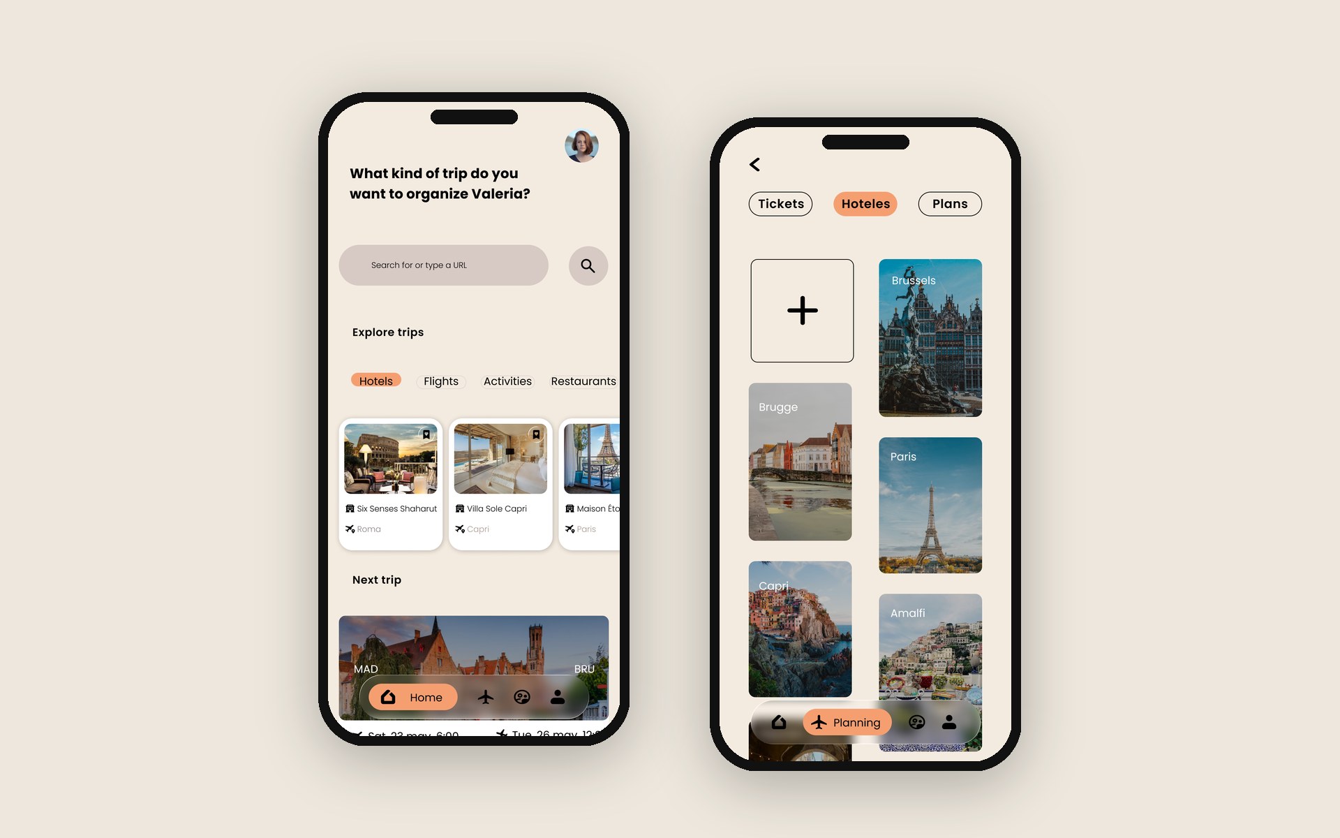
A collaborative travel planning app designed to simplify group trip organization, built end to end through a full Design Thinking process, from user research to interactive prototype and landing page.
Client
Concept Project
Year
2026
Location
Remote
Deliverables
UX Research, Wireframing, UI Design, Interactive Prototype, Landing Page
Planning a group trip is chaos. Options end up scattered across Skyscanner, Booking, Airbnb and endless WhatsApp threads, so people open twenty tabs, lose the good links and struggle to agree. The real problem isn't finding options: it's organising them and deciding together.
I ran a full Design Thinking process (Observe, Synthesise, Ideate, Design). I started with desk research and netnography on Reddit and TikTok, an in-depth interview, and a survey to size the problem. Then I synthesised it into two personas (Valentina, the organiser, and Leonel, the decider), empathy maps, customer journeys and a needs matrix.
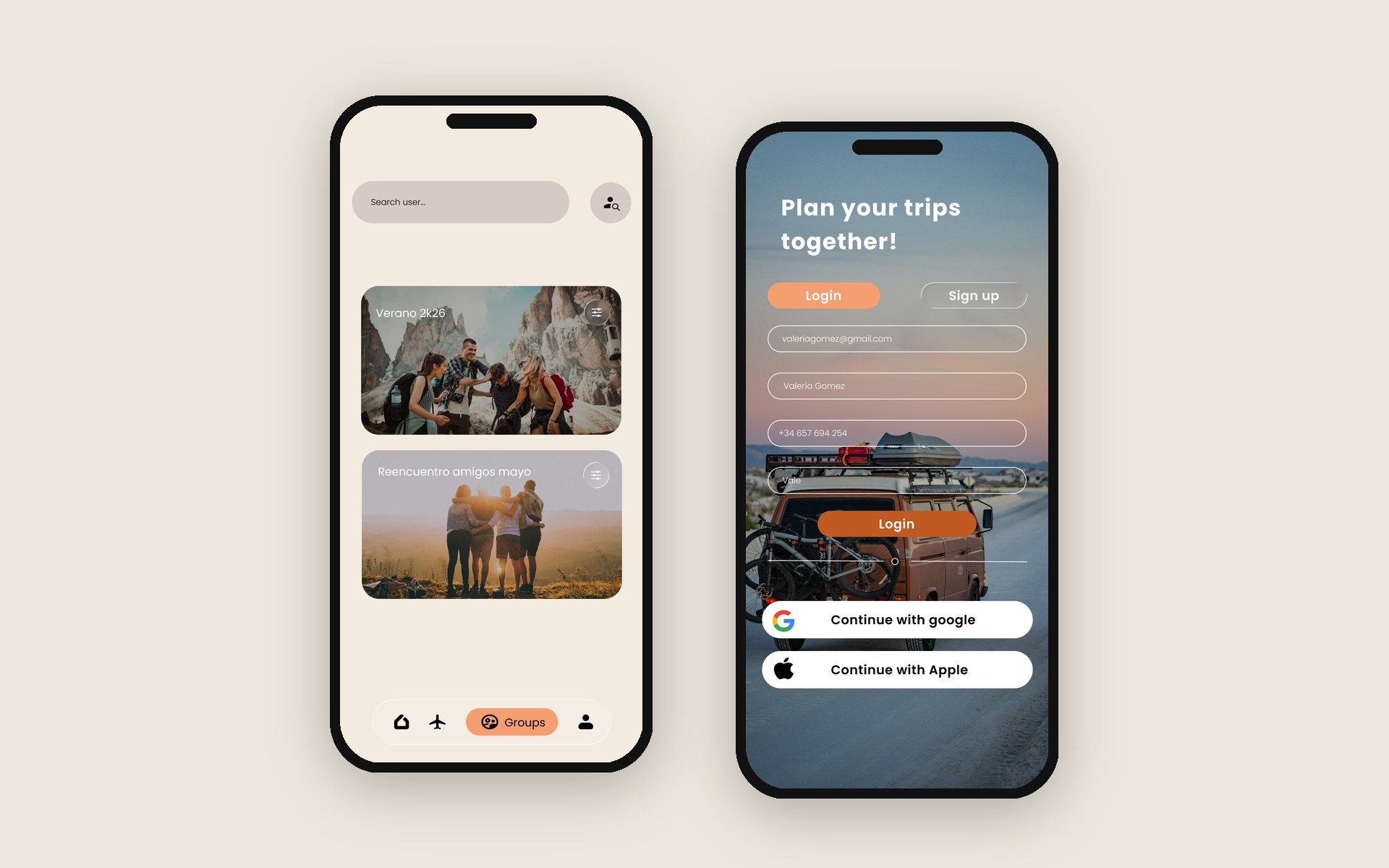
From the insights I defined the opportunity with a utility/viability matrix, an In/Out list, MoSCoW prioritisation, a value proposition and a business model canvas. Then I moved into structure and design: sitemap, user flow, wireframes, a Foundations/UI kit (colour, type and reusable components) and, finally, the high-fidelity screens.
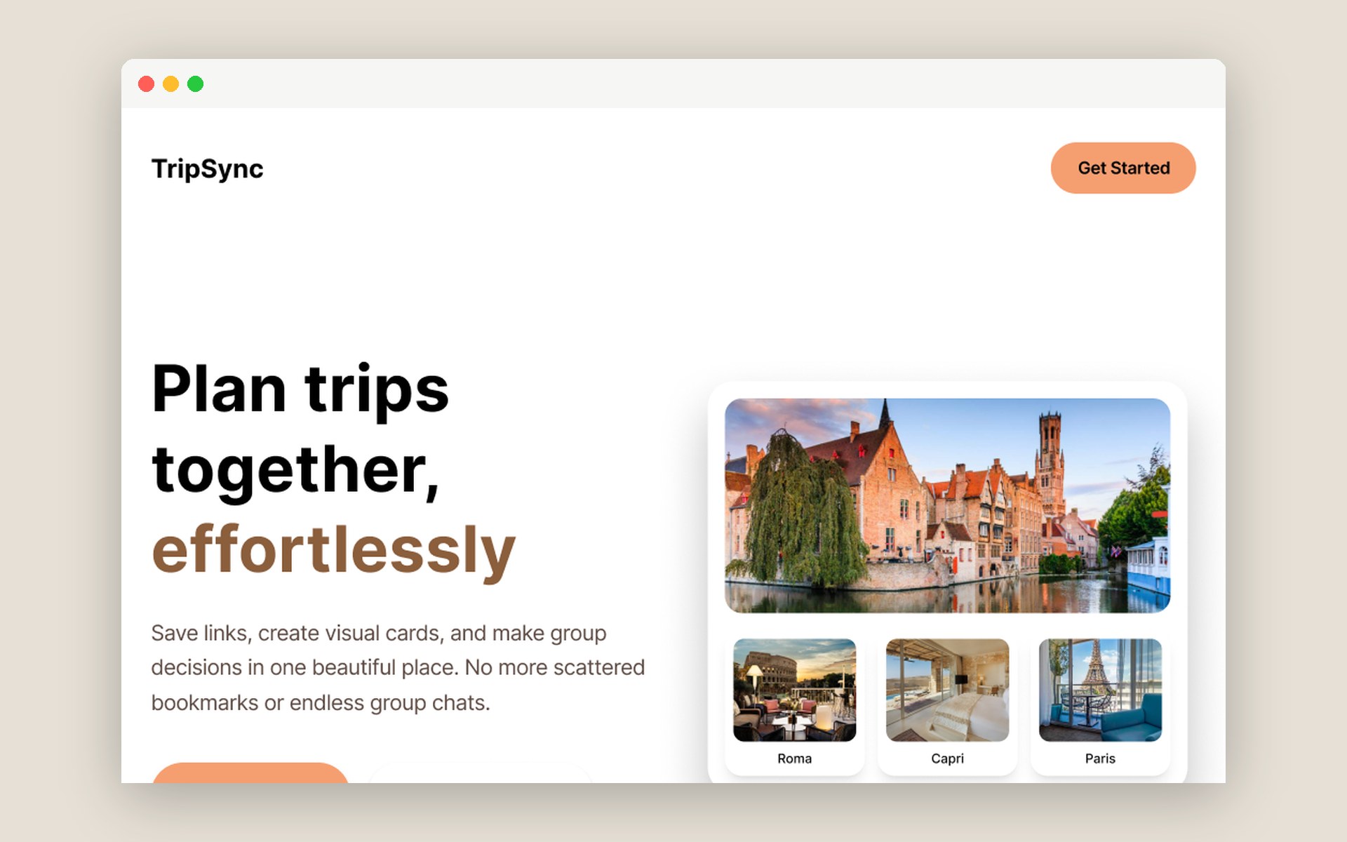
TripSync centralises the whole trip. You paste any link and it becomes a visual card; you classify options into folders (hotels, flights, plans), share the trip with friends, and everyone votes and likes to decide together, with a shared group budget. It combines organisation, collaboration and clarity so planning stops being a chore.
I validated the prototype with real users through three missions (complete onboarding, add a hotel to a folder, create a group). The app was perceived as useful, simple and genuinely different from how people plan today, with a 94% onboarding success rate. The main area to improve: bigger, higher-contrast buttons, which I fed back into the design.
Carrying a project end to end (from research to a tested prototype) taught me to let real evidence drive design decisions instead of assumptions. Balancing two personas with opposite needs, the organiser and the decider, was the hardest and most valuable part.