Posada Costa Brava
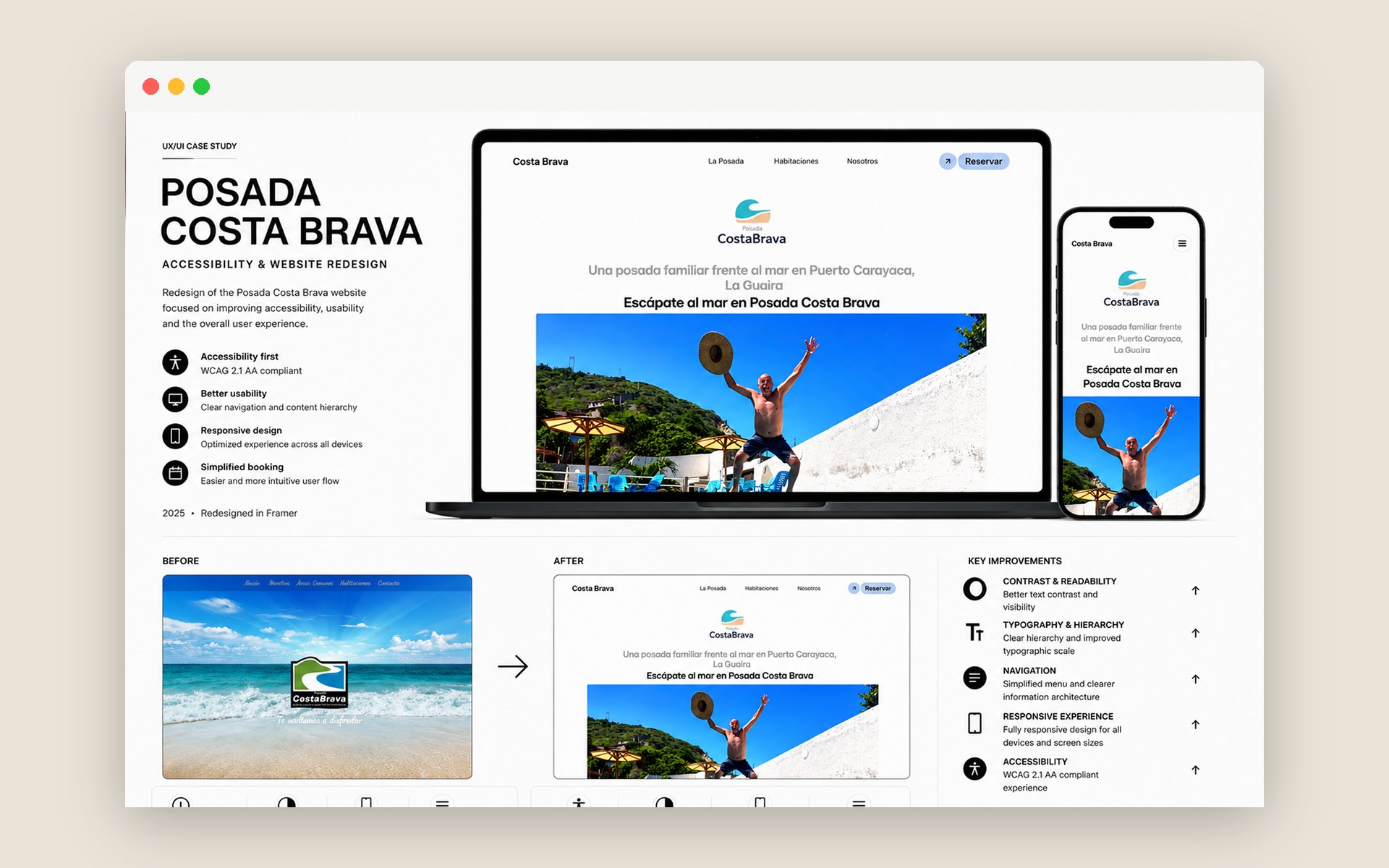
An accessibility-first responsive redesign for a family-run coastal guesthouse, rebuilding the digital experience around readability, clear hierarchy, simpler navigation and WCAG 2.1 AA accessibility.
Role
UX/UI Designer
Client
Redesign Project
Industry
Hospitality
Year
2026
Team
Solo
Tools
Figma · Framer
Focus
Accessibility (WCAG 2.1 AA)
Deliverables
UX Audit, Accessibility (WCAG 2.1 AA), Responsive Redesign, Booking Experience
The existing website needed a clearer, more accessible and responsive experience, one that helps visitors understand the accommodation and navigate the information with less effort. A quick audit surfaced four recurring issues: low, inconsistent contrast; a weak typographic hierarchy that made information hard to scan; navigation that could be simpler; and an inconsistent experience across devices.
- Accessibility first, designed around WCAG 2.1 AA.
- Clear hierarchy, make the important information stand out immediately.
- Better readability, improve typography, sizes, contrast and spacing.
- Simpler navigation, reduce friction and make sections easy to reach.
- Responsive by design, a coherent experience on desktop and mobile.
Accessibility was the backbone of the redesign, not an afterthought. I reviewed contrast, text sizes, structure, navigation and interactive elements against WCAG 2.1 AA.
| Area | Before | After |
|---|---|---|
| Contrast | Low / inconsistent | Improved |
| Typography | Difficult to scan | Clear hierarchy |
| Navigation | Less clear | Simplified |
| Responsive | Inconsistent | Adapted across devices |
| Accessibility | Not prioritised | WCAG 2.1 AA approach |
The redesign moves toward a cleaner aesthetic with stronger contrast, better readability and a clearer hierarchy, content that's easy to scan, with a central brand, a visible booking CTA and clearly separated content blocks. It was adapted across screen sizes to preserve hierarchy, readability and usability, rather than simply scaling the desktop layout down.
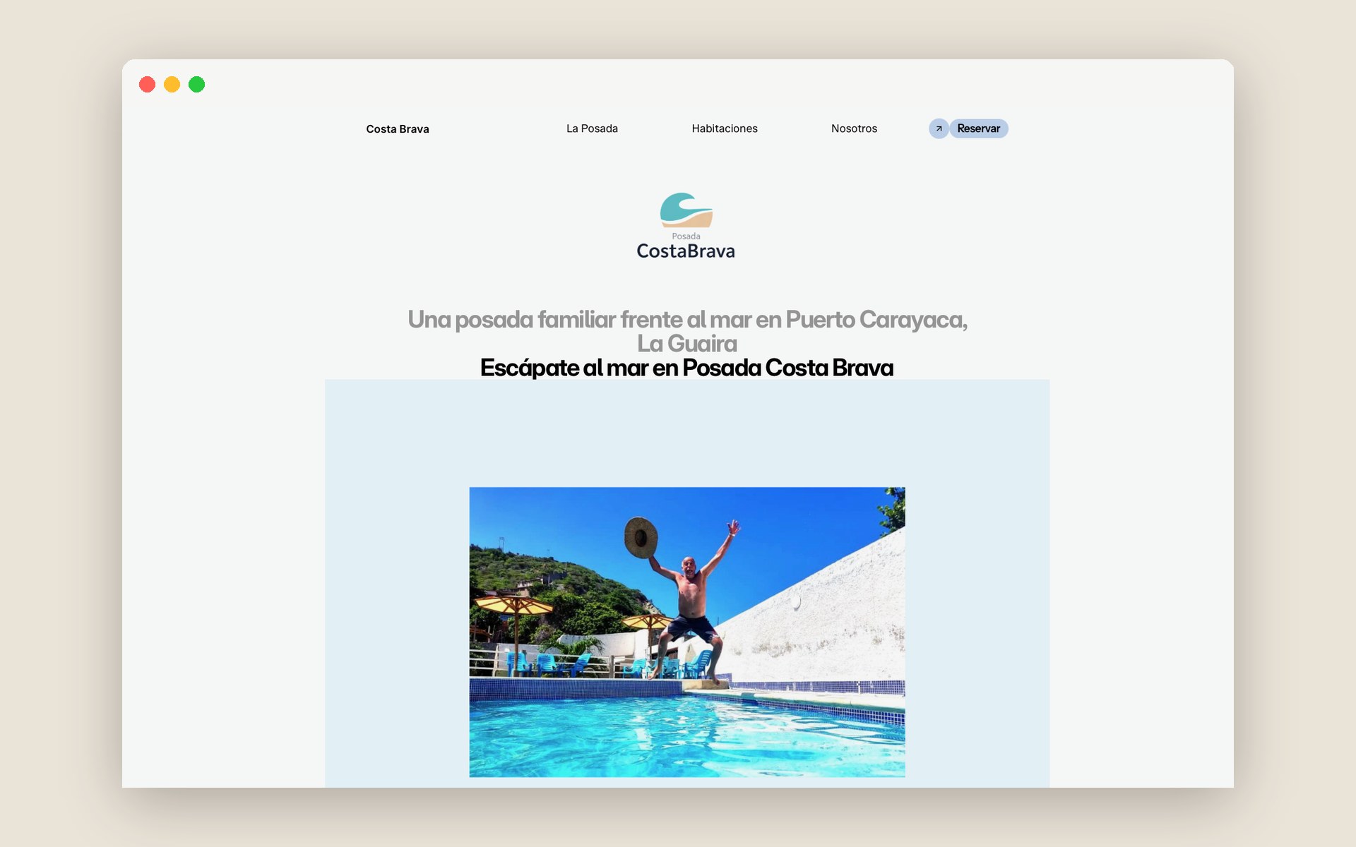
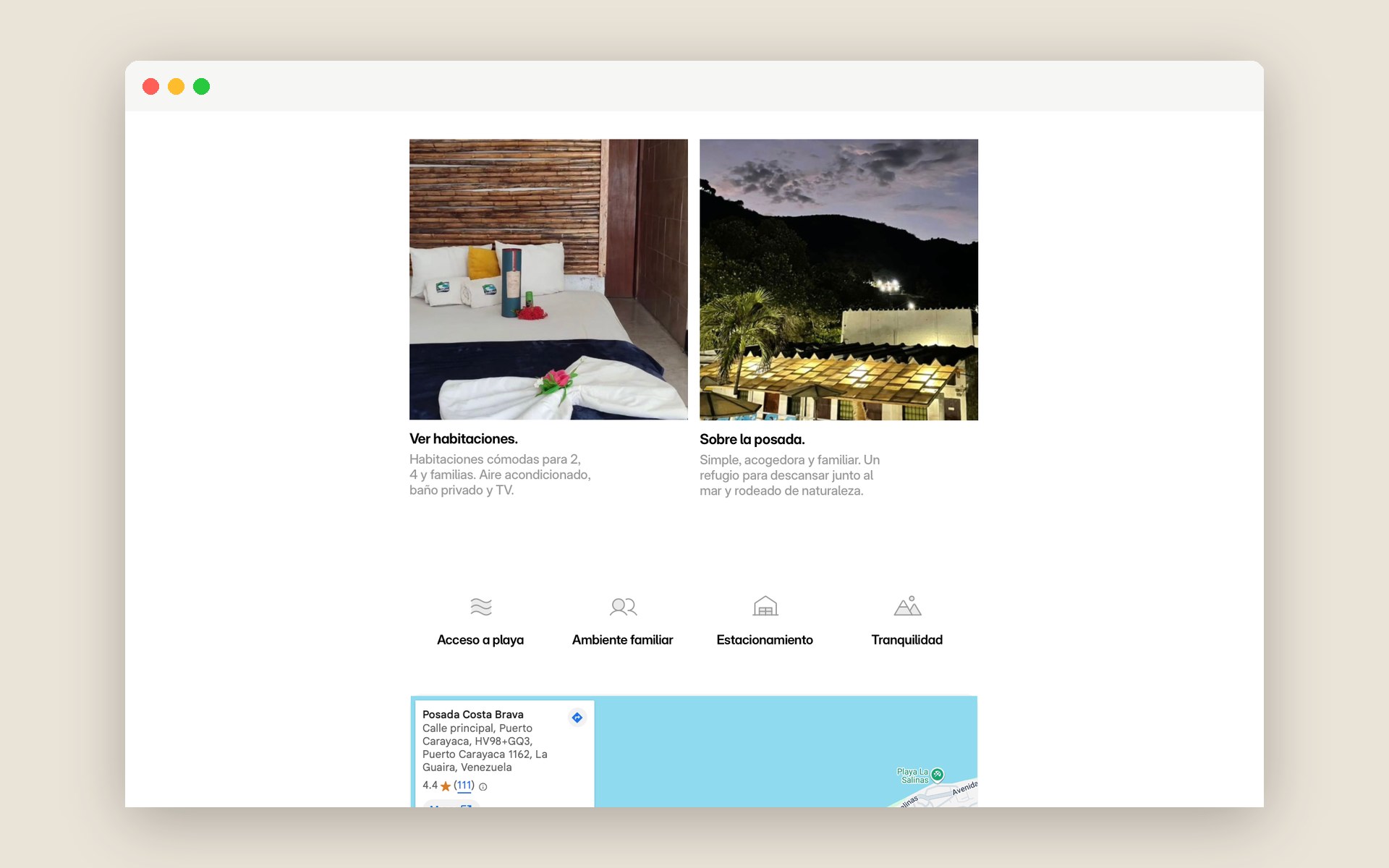
A warmer, more usable and accessible experience: improved contrast and legibility, a clearer content structure, simpler navigation, and a layout that adapts properly across devices.
This project taught me to treat accessibility as a design driver from the start, not a checklist at the end, decisions about contrast, type and hierarchy shape the whole experience, and designing responsively means rethinking the layout, not shrinking it.