Nou Tres Grupo BMS
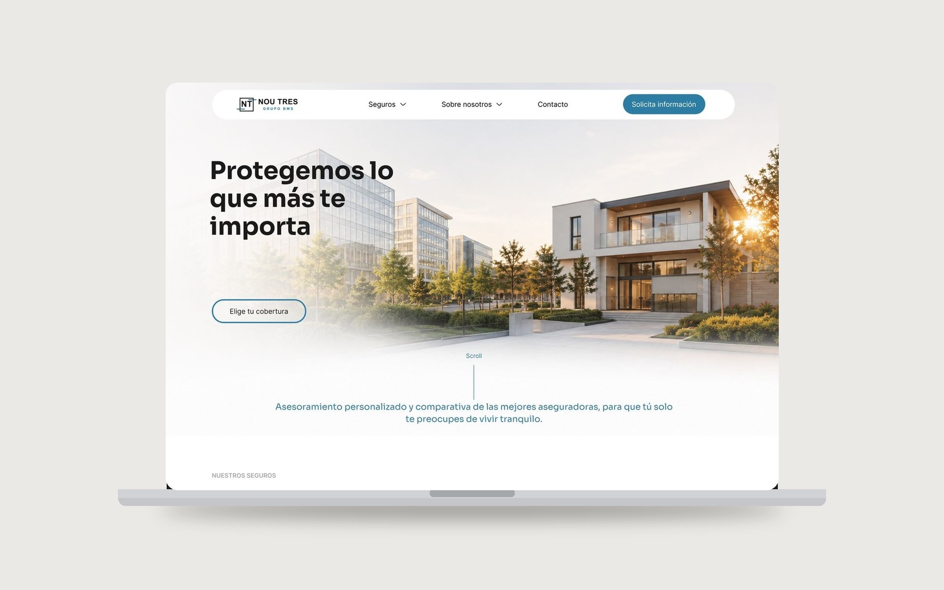
A real freelance client (via Malt): the UX/UI design of a new corporate website for a Spanish insurance brokerage specialised in businesses, assets, communities, home, life and health. The goal was to modernise the company's digital presence with a clean, professional interface, balancing trust, clarity and ease of implementation, built on a reusable design system and ready to be developed in WordPress.
Role
UX/UI Designer
Client
Nou Tres Grupo BMS, Insurance Brokerage
Industry
Insurance
Year
2026
Duration
2 weeks · Jul 2026
Team
Solo, freelance (via Malt)
Tools
Figma
Deliverables
UX Research, Information Architecture & Sitemap, Design System & UI Kit, UI Design (Home, Insurance & Landing pages), Interactive Prototype
Nou Tres is an established insurance brokerage, but their digital presence didn't reflect their experience. They needed a site that felt trustworthy from the first impression, made a broad catalogue of insurance easy to navigate, and, crucially, could be handed off and built in WordPress by their team without friction.
- Convey trust and professionalism from the first visual impact.
- Organise a broad catalogue of insurance clearly and make it easy to navigate.
- Design an interface that's straightforward to develop in WordPress.
- Create a reusable visual system for future pages.
- Improve brand perception with a contemporary, human design.
Before designing, I analysed several brokerages in the sector to map navigation patterns, content structure and visual language, and reviewed the references the client shared. That research pointed to a clear direction: a minimalist layout with generous whitespace, high-quality photography, a strong visual hierarchy, simple navigation, and calls to action that stay visible without being invasive.
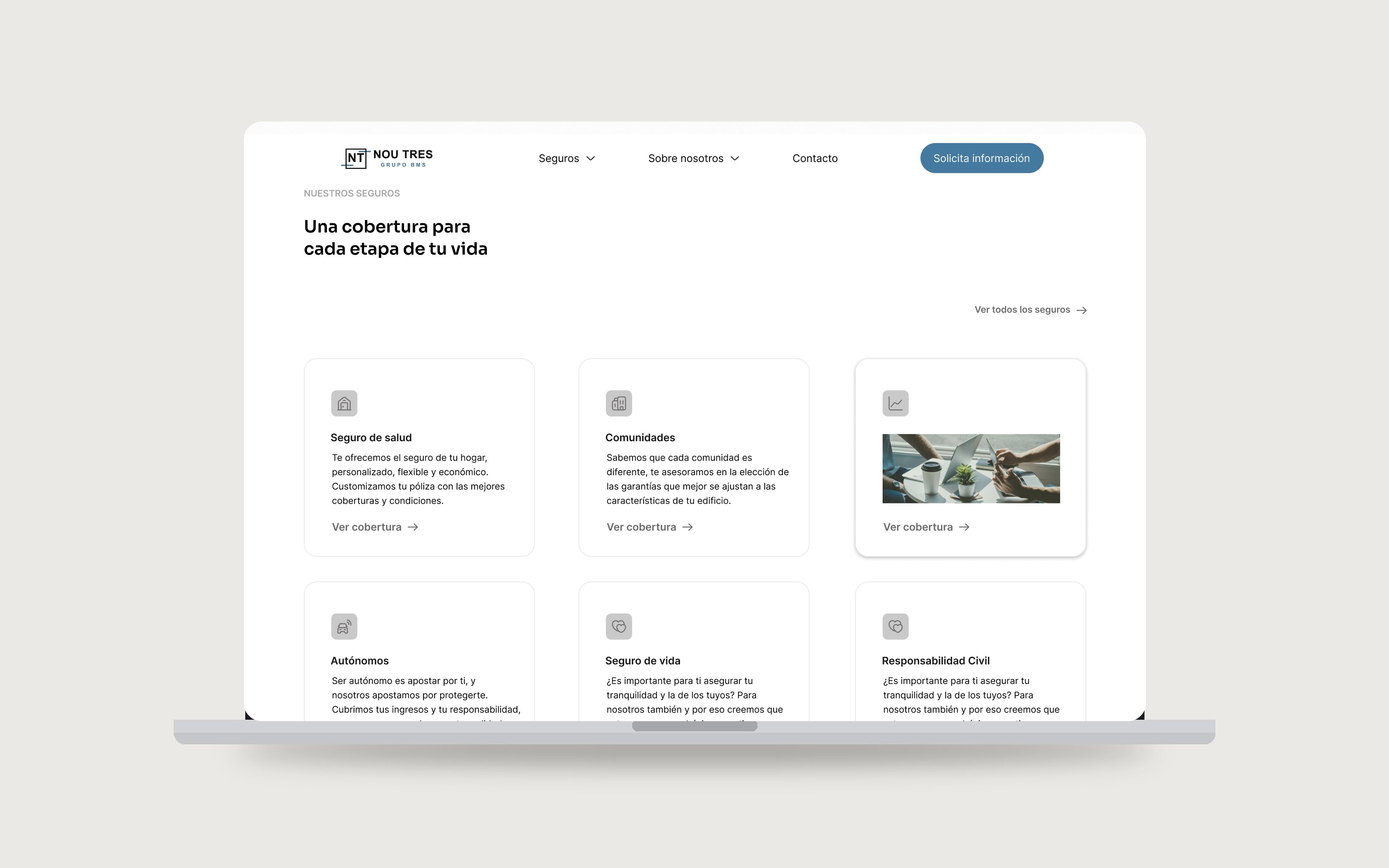
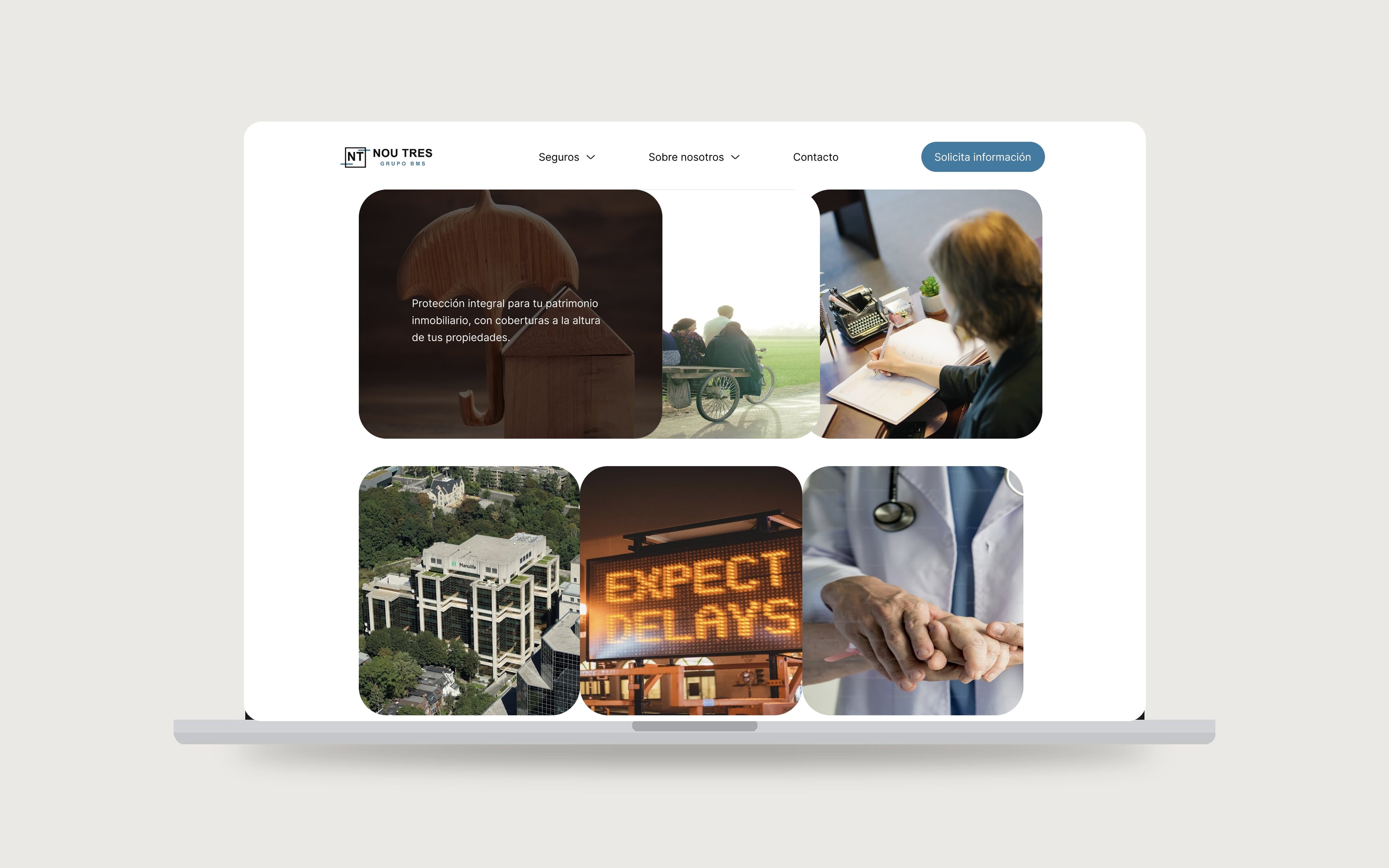
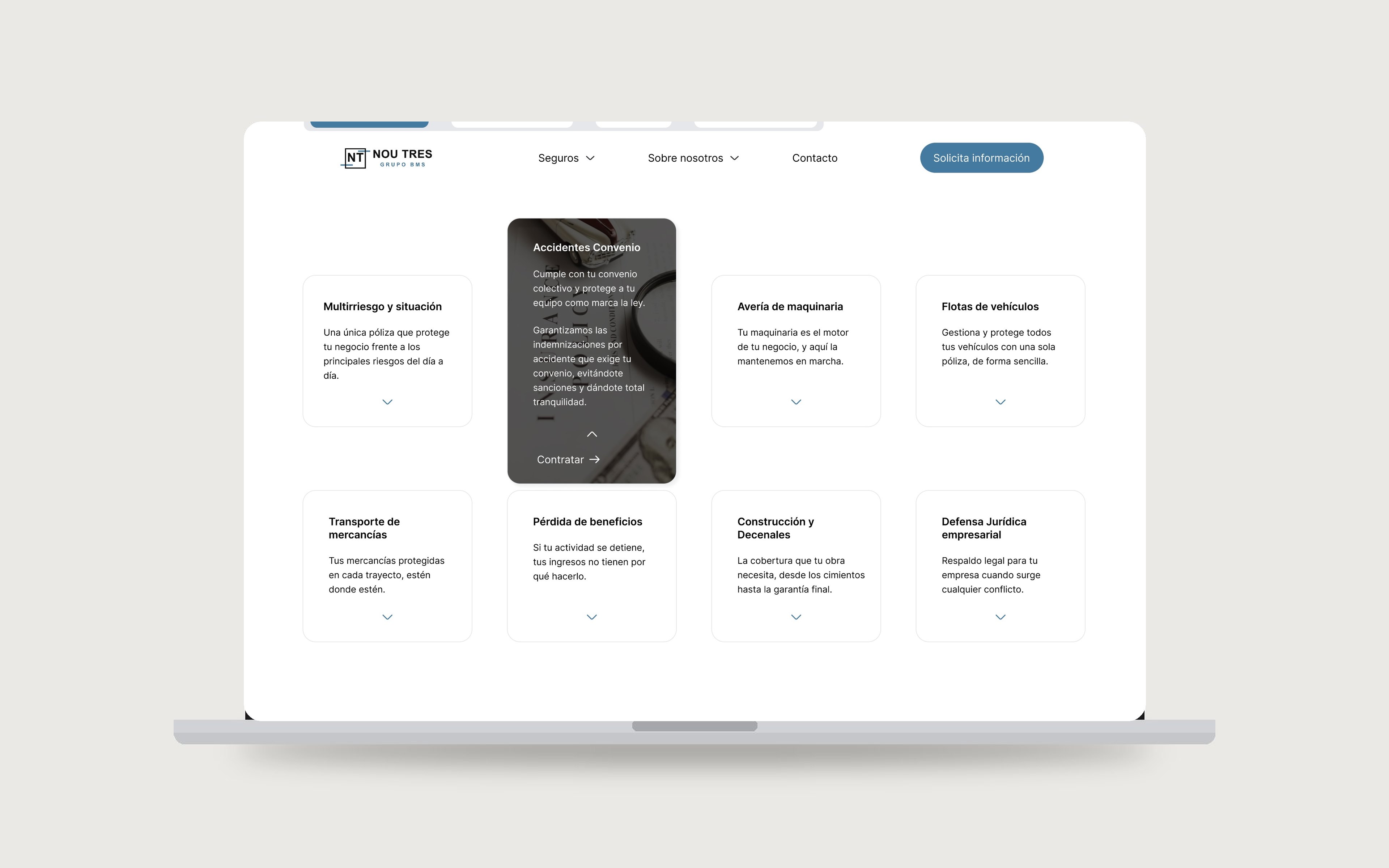
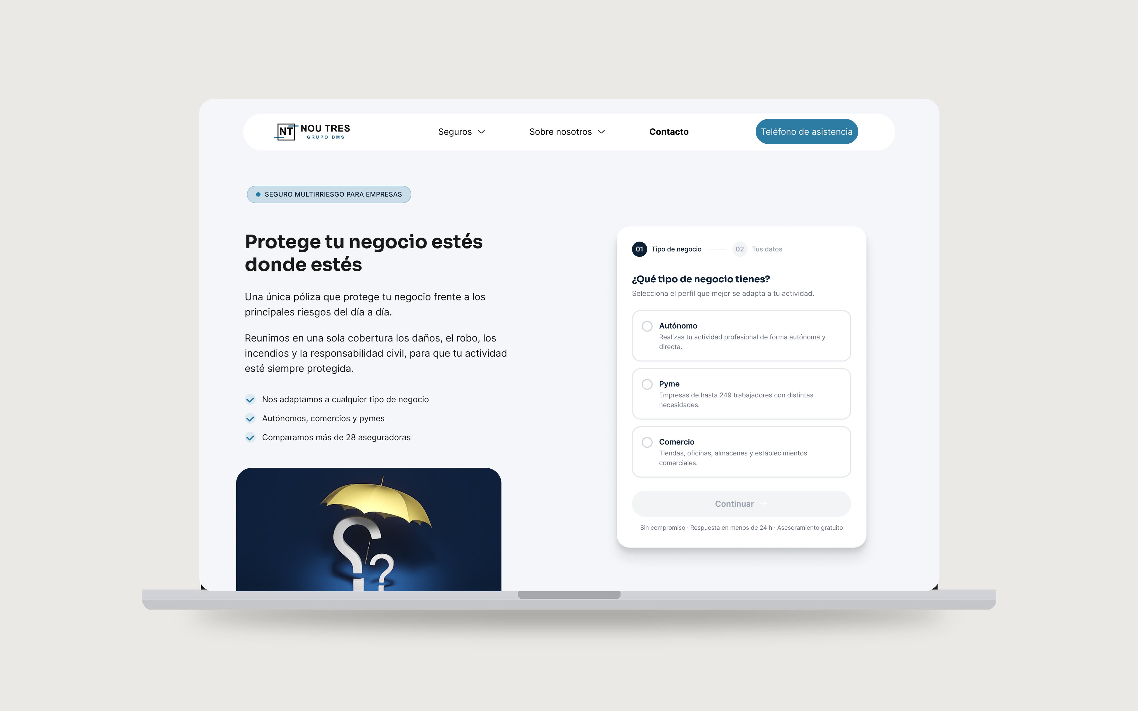
The visual identity aims for warmth without losing the corporate feel: open spaces, clean cards, modern typography, and a neutral palette with blue accents. Photography focuses on what the client protects, assets, businesses, homes and people.
Everything was built with a modular mindset to make the WordPress handoff smooth: a complete design system, colours, typography, components and buttons, plus a reusable UI Kit, so future pages stay consistent and fast to build.
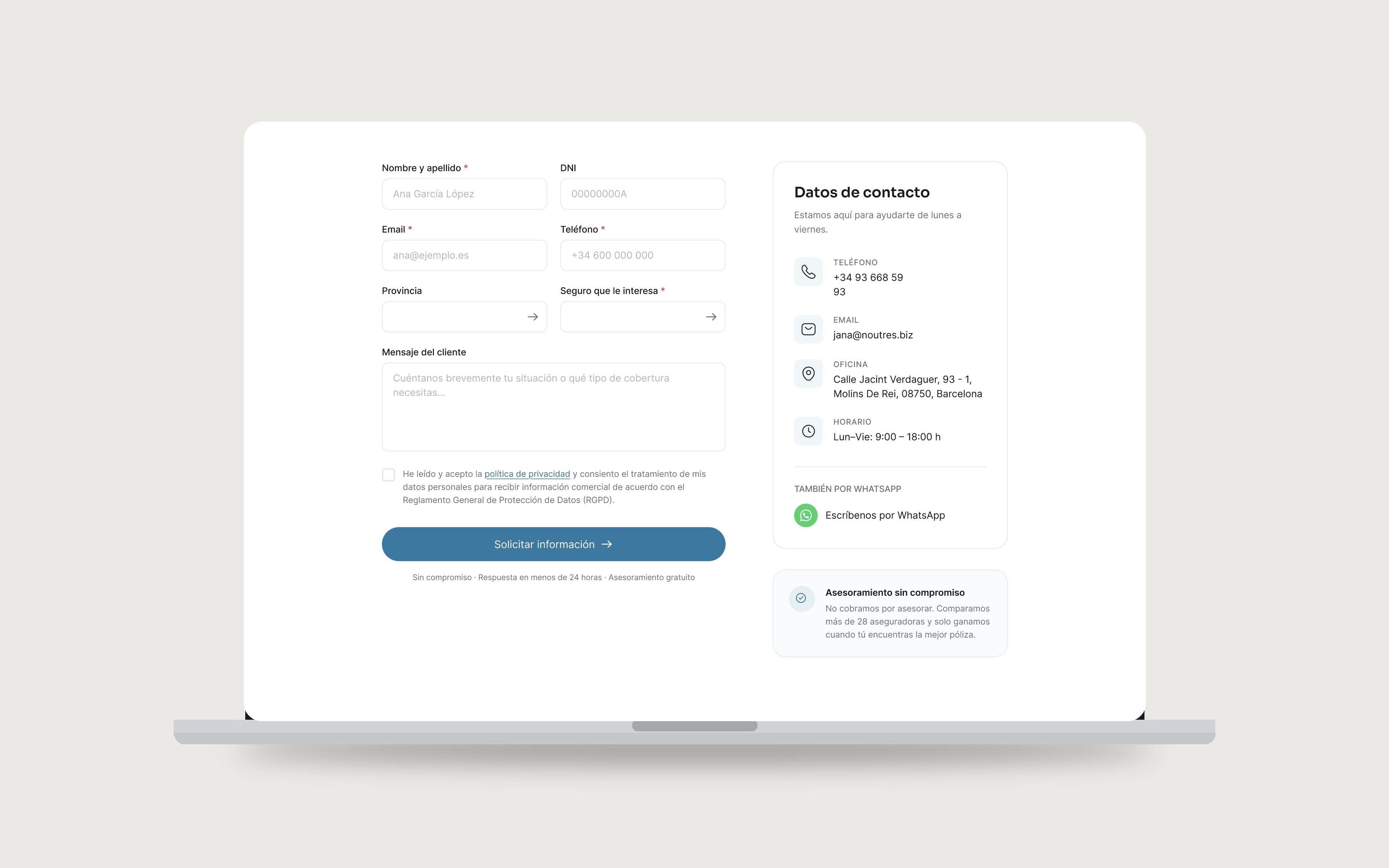
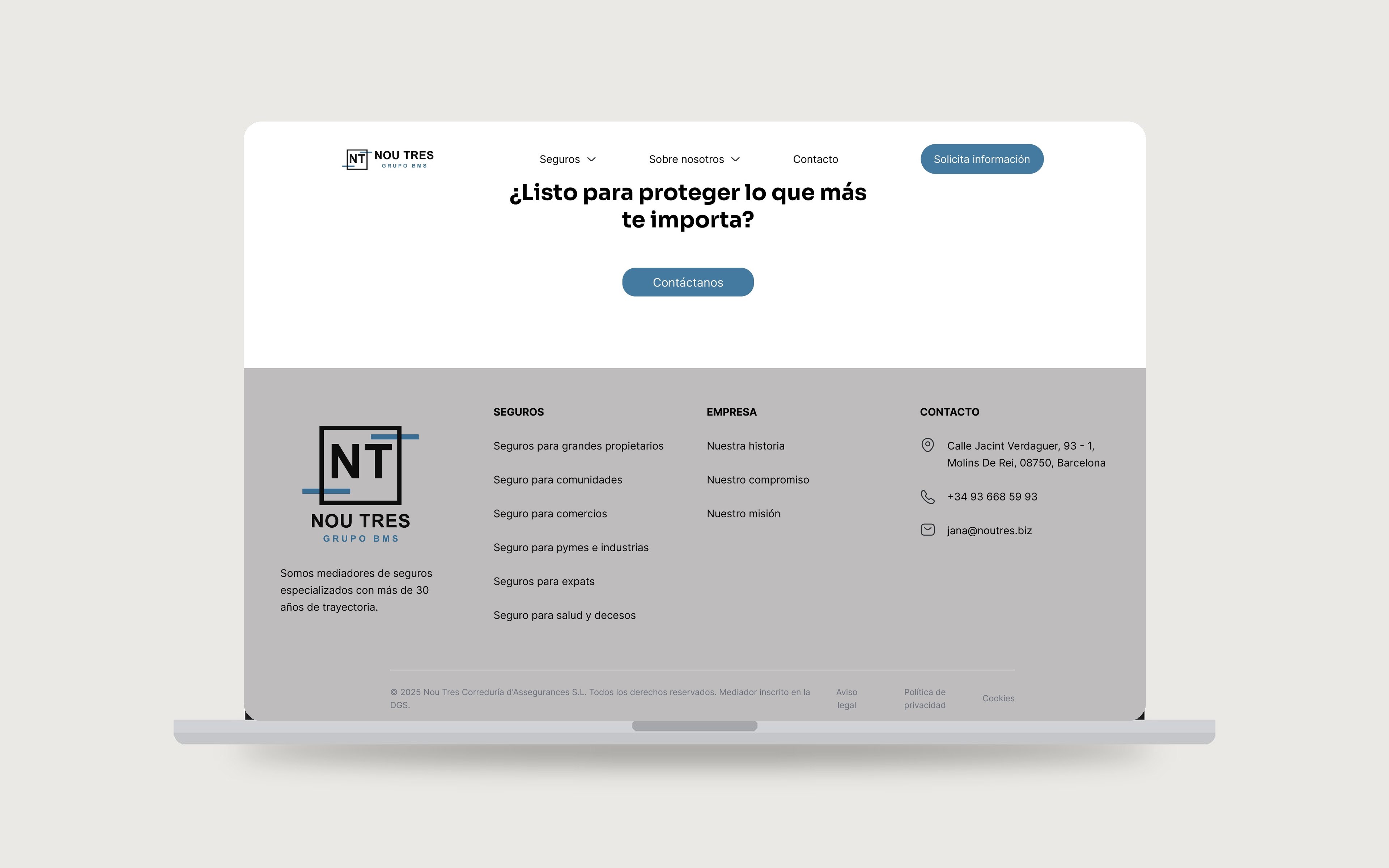
I designed the three core pages, the Home, an Insurance overview, and a specific insurance landing with a lead form, and delivered a fully navigable prototype in Figma.
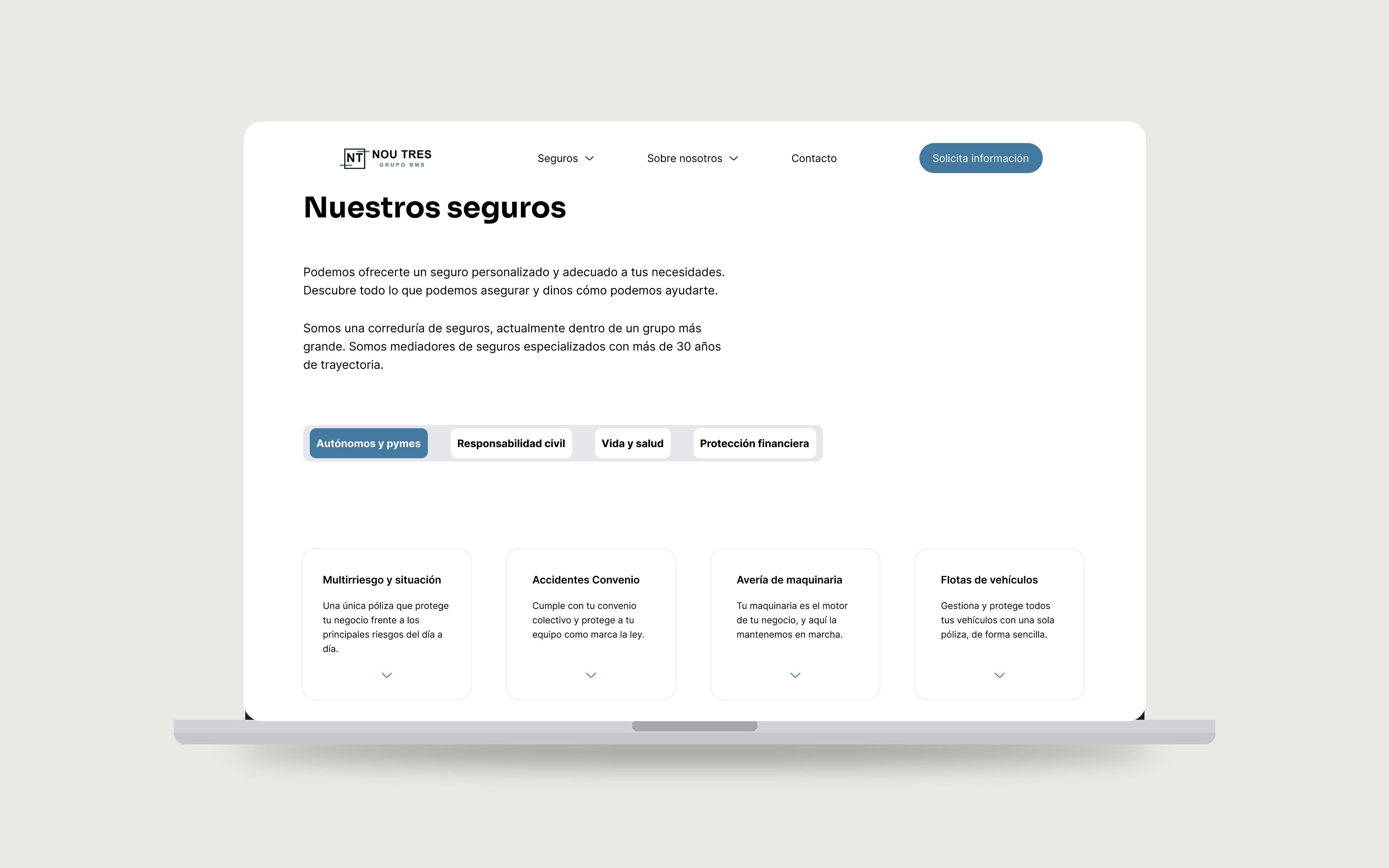
The result is a solid base for Nou Tres's new corporate website: a more modern, coherent and scalable experience that improves both the brand's perception and the development team's workflow.
Designing for a real handoff changed how I work, thinking in reusable components from day one, and balancing a client's need to convey trust with a warmer, more human feel.